

ERQ
A emergency room queue application
Goal
Streamline patients assignments through usability enhancements
For this project, I partnered with a physicians group and full stack development team in the West Coast on a redesign of a patient assignment application. As the pandemic continues to overload our healthcare system, emergency physicians are stressed by unpredictable workloads and last minute complex patient assignments, which leads to overtime and eventual burnout. The goal was to find opportunities to improve the existing workflow for physicians and coordinators.
ROLE
UX Designer
I designed the physician, coordinator, and dashboard user flows
TEAM
Stella Kim (UI Designer)
Round Horizon Development
West Coast Physicians Group
DURATION
6 weeks
TOOLS
Figma
Illustrator
PLATFORM
Web
Key Problems & Solutions
1
Give physicians more control over assignments and status updates
Physicians find having to call coordinators for changes inconvenient
2
Create clear labels and state indicators
New users don’t understand information displayed
3
Create role specific, simplified views
Physician and coordinator views are not optimized for common tasks
4
Increase visibility using icons, color, and position
Users can’t find the global navigation
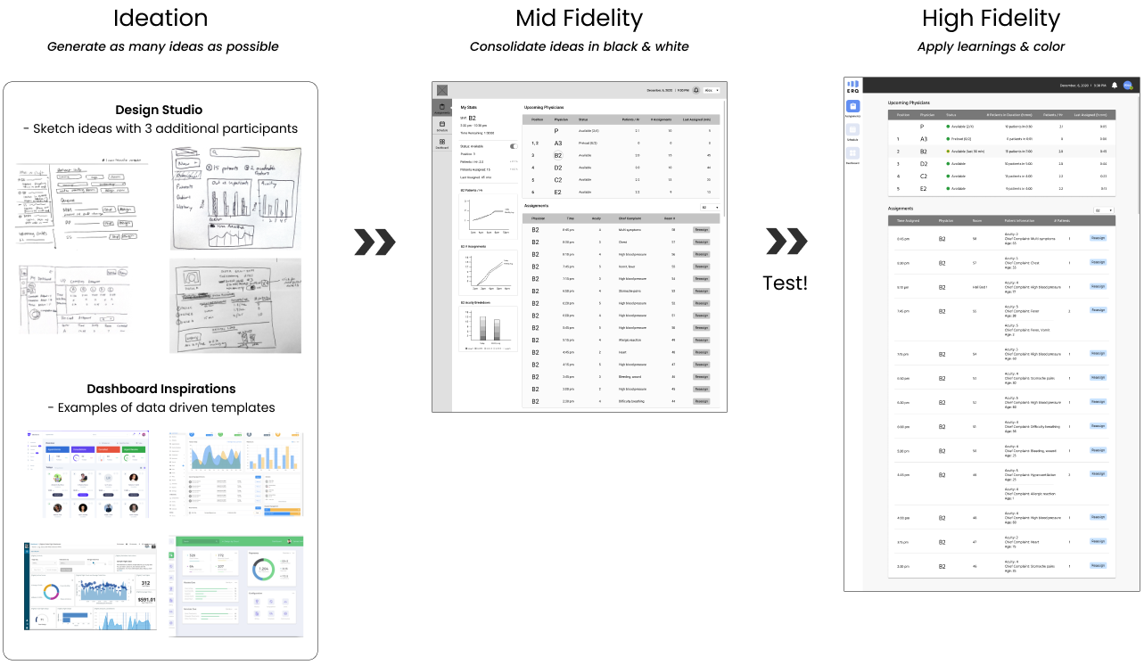
Final Concept & Deliverables
We delivered high fidelity designs, a new style guide, and summary of research insights.
Physician

Coordinator
AFTER
BEFORE


Dashboard
NEW

Project Scope & Constraints
Pre-existing User Group
From user interviews we learned that our patient assignment application was limited to our physician’s group and not applicable to other hospitals due to differences in culture and existing processes.
Focus on Existing Views
We also learned that while physician and coordinator workflow would be streamlined having a single source for patient information and not having to toggle between different applications, there were cost limitations preventing integration/migration off historical software. Therefore, our focus was on making what was already there better vs. developing new views.
Research Insights
Heuristic Evaluation
We examined the application for usability issues

High learning curve due to unclear labels and confusing system display vs. behavior
Unclear labels and usage of highlighted colors
No units included with stats
Confusing system display vs. behavior
Unavailable physicians retain position in “Up Next”
Can assign patients to unavailable and in procedure physicians
Physician view has a disabled toggle for status
Usability Walkthrough
7 Emergency Physicians & 4 Coordinators provided feedback on the redesigned application

Inconvenience calling coordinators
Several physicians mentioned it was inconvenient having to call coordinators to update their status and assignments. Some admitted that they didn’t always call despite making changes, which meant there were inaccuracies in system state.
Difficulty finding global navigation
Most users struggled with finding the “Schedule” view and did not notice the global navigation bar.
Views not optimized for common tasks
We discovered there was a gap between how physicians used the application and what was being shown:
EXISTING VIEW
USE CASE
Unclear position in “Up Next” queue
Estimate time until next patient
Default to all and not individual assignments
Confirm assignments accurate
User Personas
From our user interviews, I created the following personas:

Design Process
Solving Key Problems
1 - Giving Physicians More Control
From our research, physicians complained about having to call coordinators for updates. Even though the intention was to prevent physicians from abusing the system, having coordinators as a gatekeeper was creating additional work for both physicians and coordinators and causing system inaccuracies since physicians would not always report their changes due to the hassle.
To resolve this issue I added the following features:
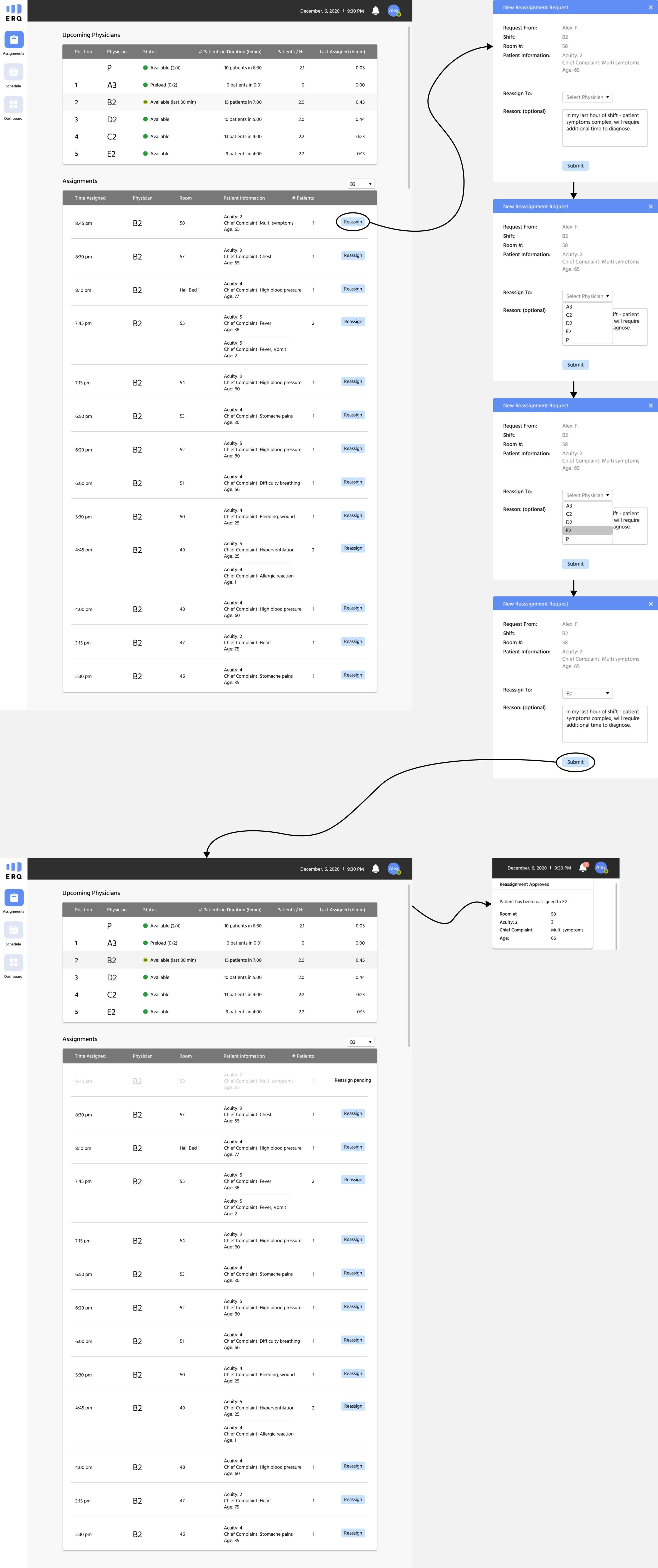
Patient Reassignment
Enable physicians to request patient reassignment and receive notifications when reassigned
DESIGN ITERATIONS
Physicians Prefer To Communicate Directly
My initial design had coordinators approving the reassignment request but after talking to physicians and coordinators in testing it was clear that this was not the desired interaction. Physicians were already communicating about reassignments with each other and did not want the coordinator as a middleman. I updated the design so that reassignment requests and approvals were between physicians.
Two Way Reassignments
Another piece of feedback I got from testing was that physicians often picked up patients for other physicians. This usually happened when a physician had extra bandwidth at the start of their shift or when only seeing pediatric patients. I updated the design to include a “Pick Up” button in the All assignments view so physicians could request patients to be assigned to themselves.

Status Update
Enable physicians to update their own status

Enabling Status Change
The original design showed a disabled status toggle which confused many physicians who tried to click on it. In the mid fidelity design, I enabled the status toggle in a new section called “My Stats.” Feedback from usability testing suggested that the “My Stats” panel was redundant and physicians preferred a simplified view so I moved the status update location to a menu under the physician’s name in the high fidelity design.
Creating Distinct Physician States
I wanted to resolve the confusing system display vs. behavior issue discovered in heuristic evaluation. The original status toggle had an “On” and “Off” option, implying the user was “Available” or “Not Available.” However, this was an oversimplified view as the user could be “Off” and in “Procedure” but available for less complex assignments and appearing in the “Up Next” queue. To reduce confusion, I created 4 distinct user specified states: Available, Procedure, CODE, and Unavailable.
STATE
Available
Procedure
CODE
Unavailable
MEANING
Can be assigned any patient
In a procedure and can be assigned only Acuity 3-5 (less complex) patients
In CODE and should not be assigned any new patients
Unavailable for reason other than CODE and should not be assigned any new patients
2 - Creating Clear Labels and State Indicators
During research we discovered that the application had a high learning curve for new users, who struggled with understanding what the application was doing. They lacked context, confused by unclear labeling, missing units, and physician state indicators.
I included the following updates to clarify:

3 - Create role specific, simplified views
The usability walkthrough revealed that the physician and coordinator views were not optimized for their common tasks.
Physicians primarily used the application to see their position in queue/estimate time until next patient and verify their assignments. However, their default view required them to scan through the upcoming queue for their position and showed all patient assignments. To make it easier to use, I highlighted the physician’s information in queue and included their position number. I also defaulted the assignment’s view to be physician specific so physicians do not have to scan through other physician’s assignments.
Coordinators primarily used the application to add assignments and help physicians update status. The usability walkthrough revealed that coordinators are not interested in physician stats.
