
Emergency Queue (ERQ)
Reducing inefficiencies in patient assignment system to improve physician work-life balance


The challenge
How might we improve the patient assignment experience so ER physicians have better work-life balance?
Emergency physicians are stressed by unpredictable workloads and last minute complex patient assignments, which leads to overtime and eventual burnout. The US National Physician Burnout & Depression Report reported 60% burnout by emergency physicians, the highest among all specialities. This number has been steadily rising since 2019 when it was 47%. A group of emergency physicians are trying to combat this and improve physician work-life balance through creating a smart patient assignment system that takes into consideration factors like remaining shift time and patient complexity and distributes patients based on physician load.
My role
I focused on the UX - leading the user research, defining the solutions, and designing the user interactions. I partnered with a UI designer who focused on the visuals and branding. When we joined the project the development team was redesigning the existing application to incorporate smarter algorithms for patient assignment. Our role was evaluating and iterating this new experience. We collaborated closely with the physicians group and development team to understand requirements, share insights from user research, and get regular feedback on designs (verbal and through usability testing).
User research
Defining scope and target users
One of the first questions we wanted to answer was what was the reach of this application? We interviewed emergency physicians in different hospital groups to understand how their hospitals handled patient assignments and if they faced similar challenges and would benefit from using this application. We learned this application was specific to our physicians group because:


They operated on an fixed payment structure. Unfair patient load was a big deal for physicians in our group since they had a fixed salary. This was not the case at many other hospital groups where pay was directly correlated to number patients seen and physicians had some control over their workload by choosing to pick up more or less patients.
The patient assignment process was different at each hospital and group culture played a key role in how assignments were made. In some hospitals it was purely voluntary where physicians would pick patients from a shared board. Other hospitals assigned patients into groups based on acuity and physicians would rotate between groups.
While burnout was a shared concern among emergency physicians, given the culture differences and established processes in each hospital group, it seemed like a one-size-fits-all approach would unlikely be adopted. Therefore, we decided to keep the scope constrained to designing an application for our physician group.
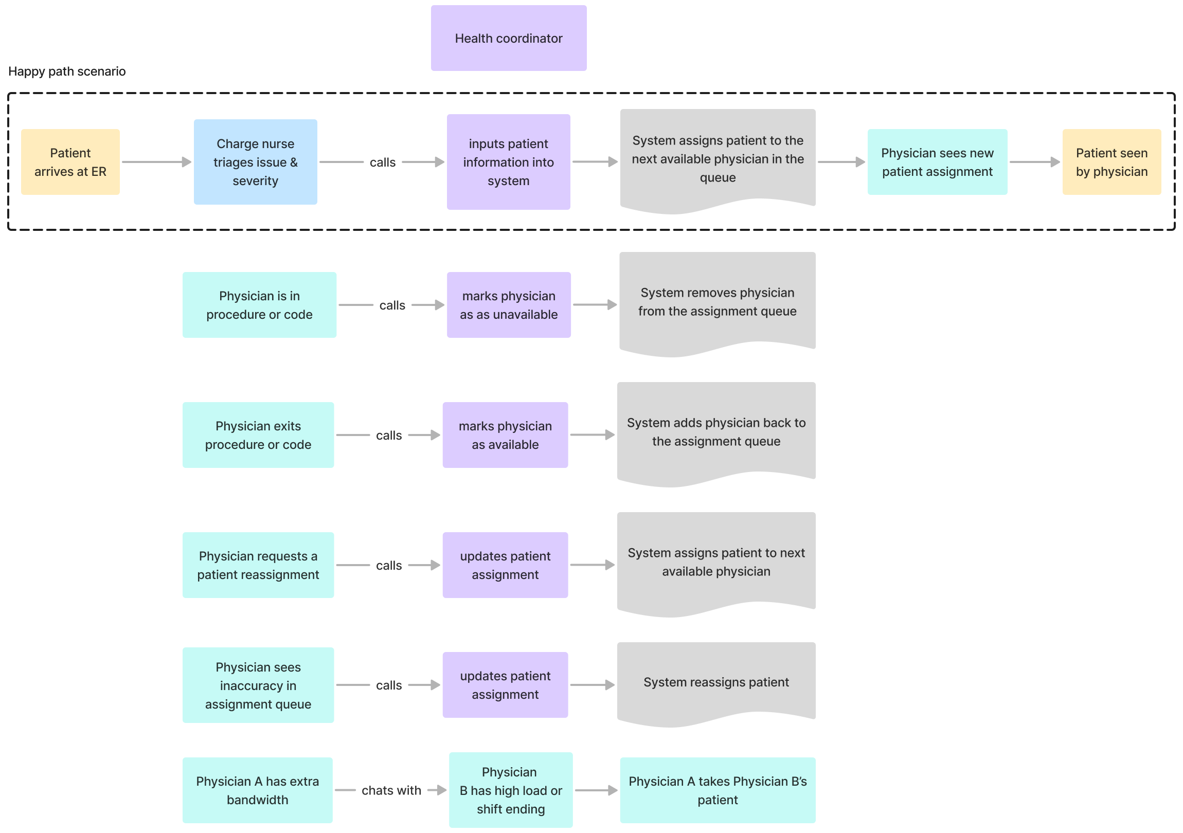
Patient assignment process
After interviewing physicians and health coordinators, I outlined the current patient assignment process and common edge cases. It was clear that even though there was a system for automating patient assignments a lot of communication was being done off-platform through phone calls and chats. The health coordinator was a bottleneck since they were the only ones who could make updates to the system.
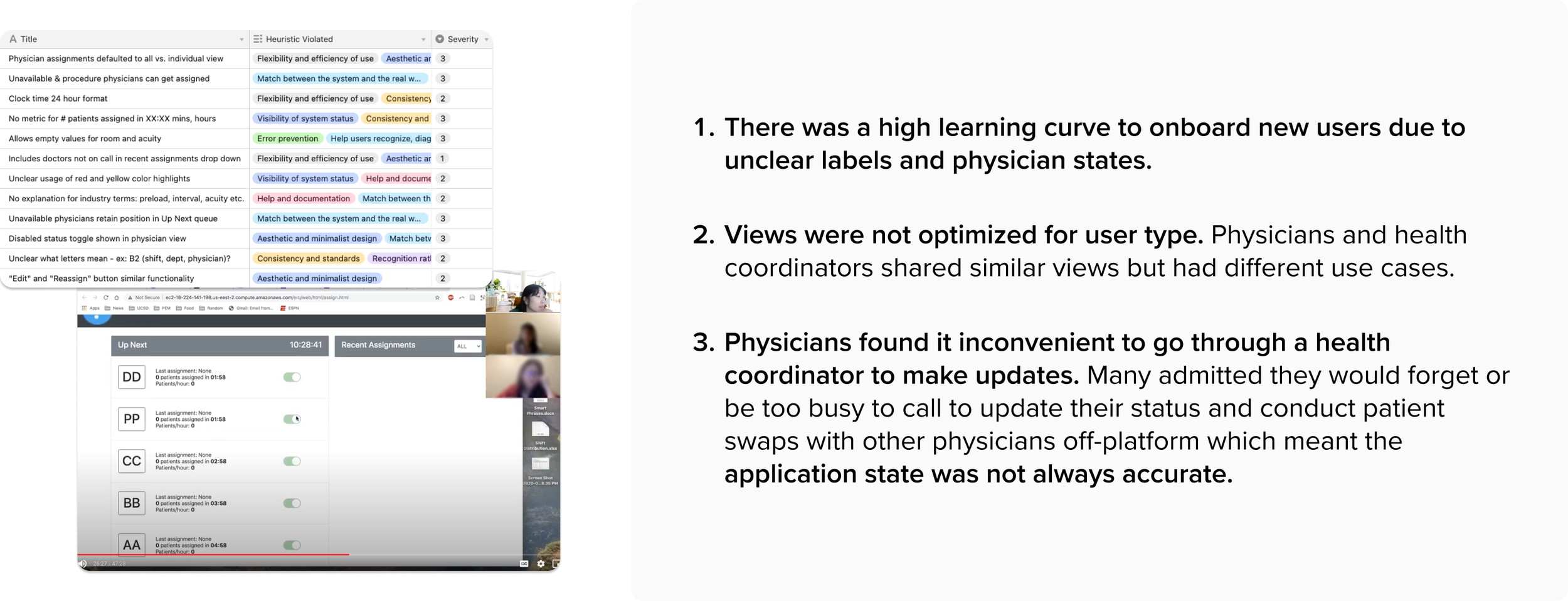
Usability issues
From our heuristic evaluation and usability walkthrough with physicians and health coordinators, we discovered:
Constraints
While there were many inefficiencies with data entry and duplicate information being entered manually (and sometimes incorrectly) it was too costly to enable data sharing between EPIC (patient record system) and the patient assignment system. Therefore, we decided to focus our solutions on what was realistic for the budget.
Personas
After talking to physicians, coordinators, and the development team, we realized there were actually 4 different users of this application. We constructed personas to capture the different users and their goals.

Design process
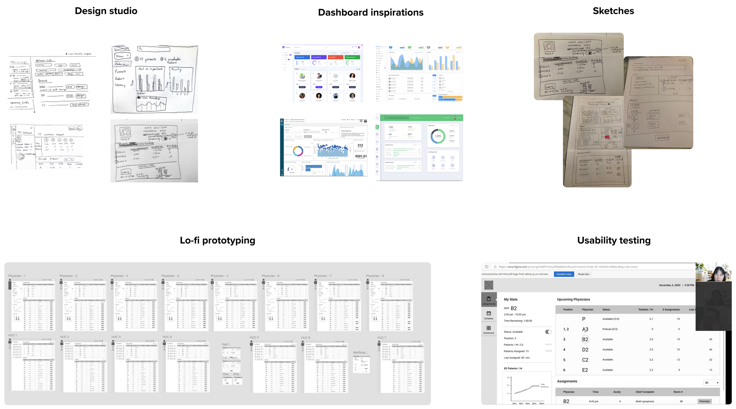
For inspiration, we did a design studio with other participants to generate as many ideas as possible. I looked at other dashboard examples before starting to sketch solutions. I prototyped and tested the solutions in low-fidelity before converting to high-fidelity.
Solutions
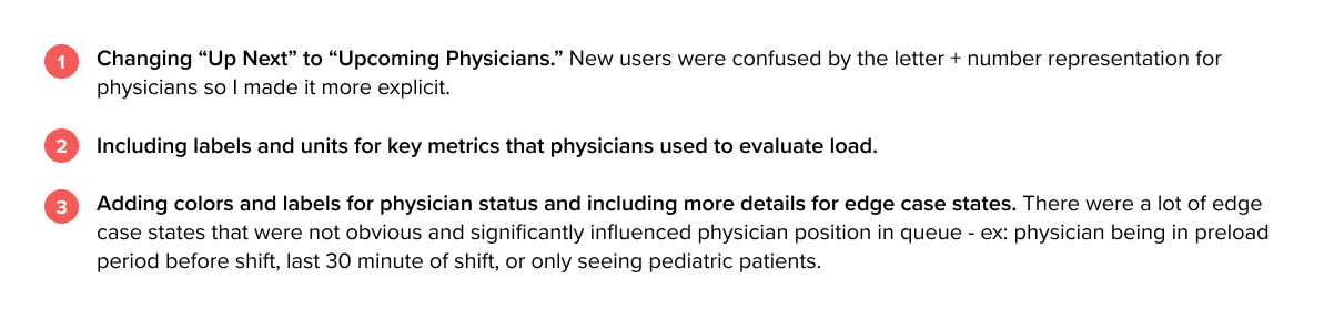
Clear labels and status indicators
During research we discovered there was a high learning curve for new users who struggled with understanding what the application was doing. They lacked context, confused by unclear labeling, missing units, and ambiguous physician states. I solved this by:
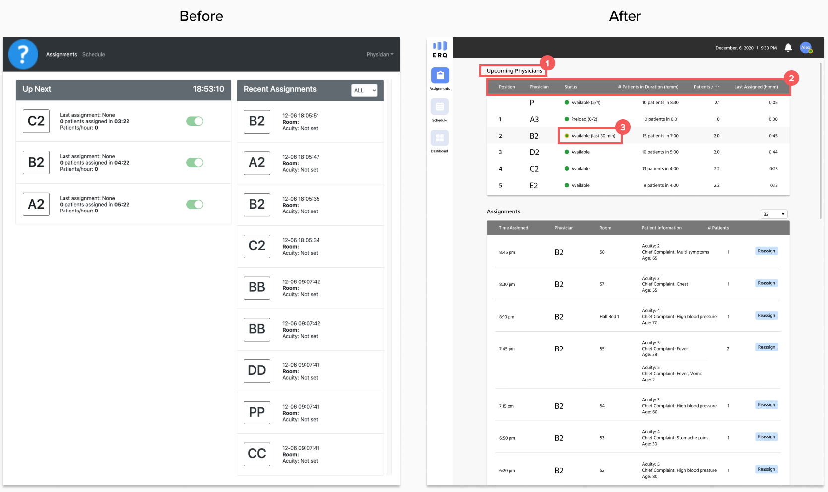
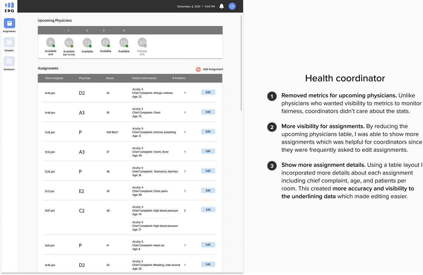
Role-specific views
The usability walkthrough revealed that views were not optimized for users’ common tasks. Physicians, health coordinators, and the medical director all shared similar views even though had very different use cases:
Physicians used the application to see their position in queue/estimate time until next patient and verify their assignments
Coordinators used the application to add/edit assignments and help physicians update status
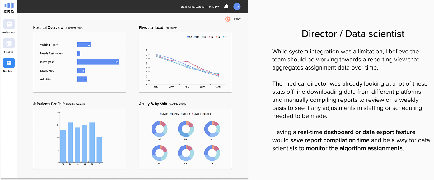
The medical director used the application to review physician load and make scheduling and resourcing adjustments
I created role-specific views keeping in mind each user type and their goals.
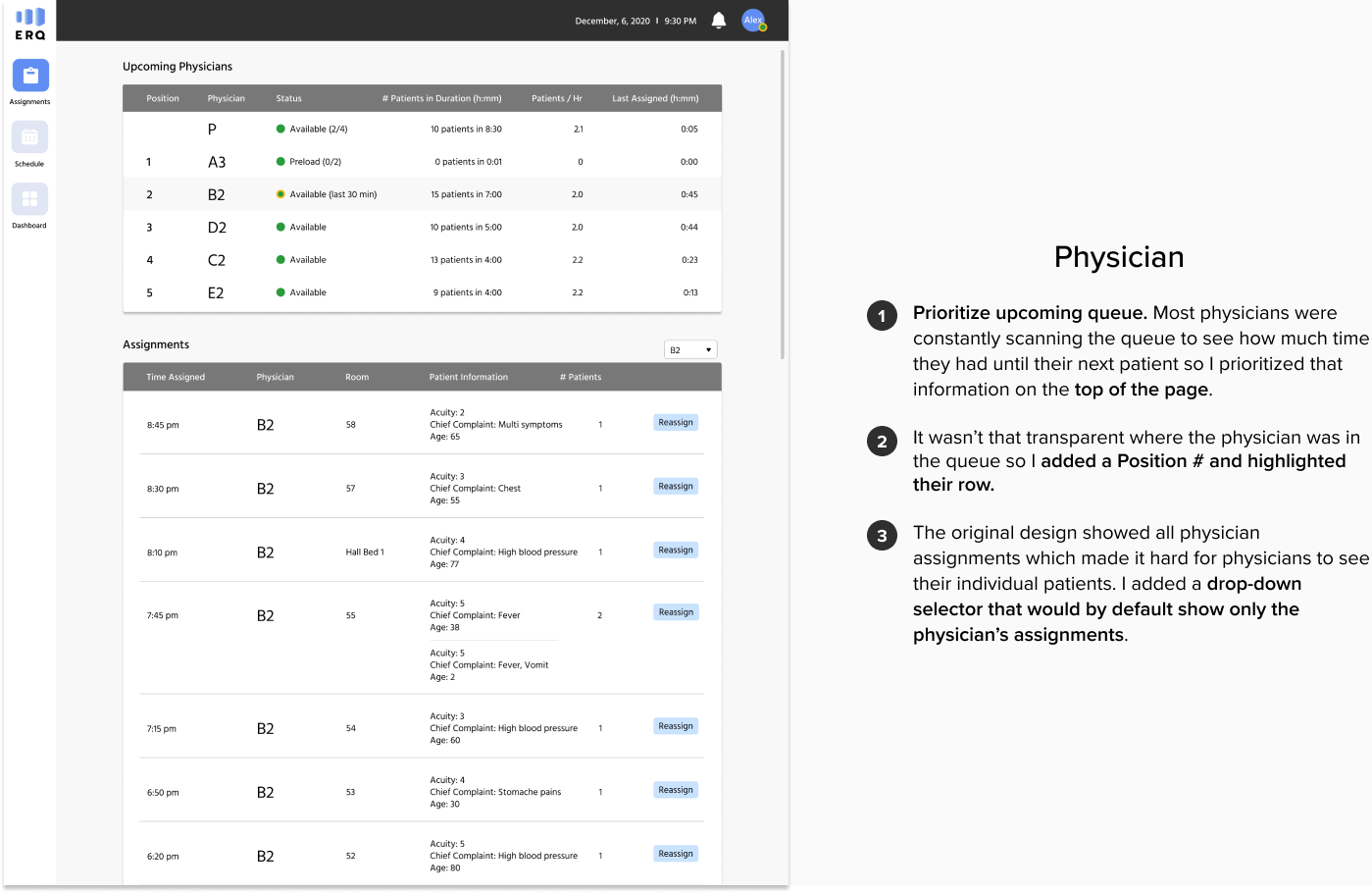
Give physicians more control
During research, physicians expressed inconvenience with having to call coordinators to make an update. The original intent was to ensure that the system wasn’t being abused but it was actually causing additional work and system inaccuracies since physicians ended up making changes anyways without telling the coordinators. I felt that the right approach was to trust physicians and rely on reporting to surface any issues. After all, all changes were being tracked and it was easy to figure out if a physician had a history of seeing less patients.
Giving physicians ability to reassign patients and update their own status would significantly streamline both the physician and coordinator workflows and also provide valuable feedback for data scientists for algorithm optimization.
Results & learnings
The physicians group was really excited about incorporating our solutions especially around granting physicians more control. They really liked our direction and provided positive feedback during usability testing. When we left the project the physicians group and development team were in contract negotiations to incorporate some of the features we proposed.
My key learnings:
Explore different ideas but support what the end user wants to achieve (you are not the user). One of my initial ideas was to deprioritize the physician metrics because I felt that it was a distraction for physicians and taking away from their time with patients. My hypothesis was that physicians wanted to see the data because they didn’t trust the algorithm to accurately assign patients but once they had confidence, they wouldn’t need to look at it as much. While that may be true, I realized I was thinking more from my perspective and not from the user’s. This physicians group had a culture around transparency, visibility, and fairness. They were competitive and wanted to see what other physicians were up to.
Users can be used to seeing things a certain way and be less receptive to change (it’s okay not to reinvent the wheel). When exploring concepts for showing data my instinct was to present charts and graphs. The physicians group was not into this at all. They were used to seeing very specific metrics to quantify load and did not want to see this information presented in a different way. In fact, they found the charts and graphs distracting and wanted to minimize those views - one commenting dryly “I know when I’m working hard - I don’t need to see a chart to tell me what I already know.”
Intermediate solutions can be good solutions if they are a step in the right direction. I had to abandon some obvious solutions due to budget constraints. It would have significantly improved the coordinator workflow to enable data sharing so they didn’t have to keep copying the same data from one platform to another. Since we couldn’t change that, I ended up making smaller changes around showing role-specific views, reducing the number of required fields for data entry, and making it easier to add multiple patients at once.
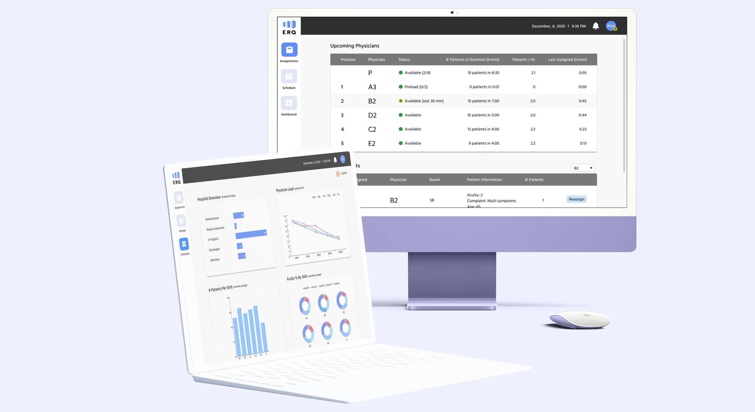
Additional demos
Demo of health coordinator assignments and dashboard