
Bay Area Transit
Promoting discovery and understanding of safety measures and metrics to increase ridership

The challenge
How might we ensure riders are aware of safety measures and give them confidence to ride?
Bay Area Transit (BART) is a heavy-rail public transit system that connects the San Francisco Peninsula with communities in the East Bay and South Bay. People utilize BART for their every day transportation needs including commute and recreation. Since the start of the pandemic BART has been experiencing a 88% decline in ridership. Many people who previously used BART are not riding because they want to avoid crowds and exposure to coronavirus.
My role
I worked with two other designers to conduct user research and define the scope of this challenge and possible solutions. This case study is structured around my area of focus: promoting safety awareness in the mobile application and showcases the designs I created.
“I think we have a perception problem. People see trash and dirty windows and think BART is unsafe when in reality we are doing a lot to reduce COVID risk.”
User research
Understanding the problem
After talking to BART’s Chief Communication officer, we learned:
BART is not meeting goal of 50% pre-pandemic ridership, trending at only 12%
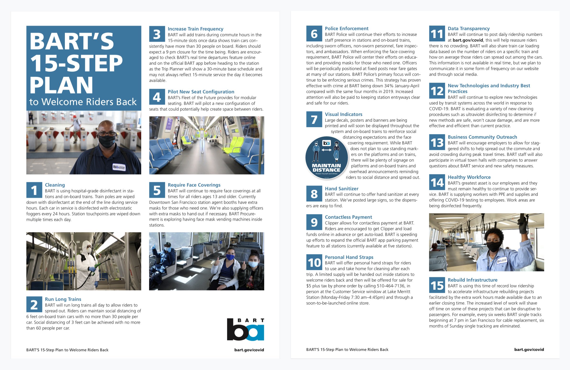
Despite issuing a 15-step plan, they are concerned riders are not aware of all the measures BART is taking to keep people safe
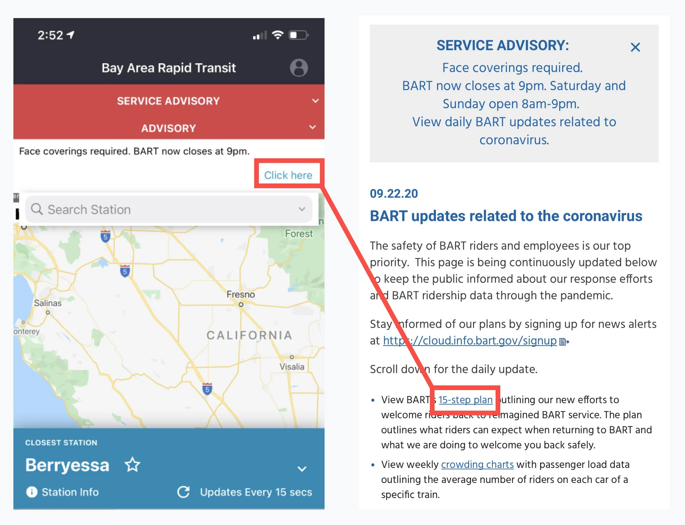
Difficulty finding and interpreting safety information
Since the majority of our surveyed riders used the BART mobile app as their primary source for trip planning, I performed a heuristic evaluation on the mobile experience, which revealed significant challenges finding and interpreting safety information.
Hard to find & text-heavy
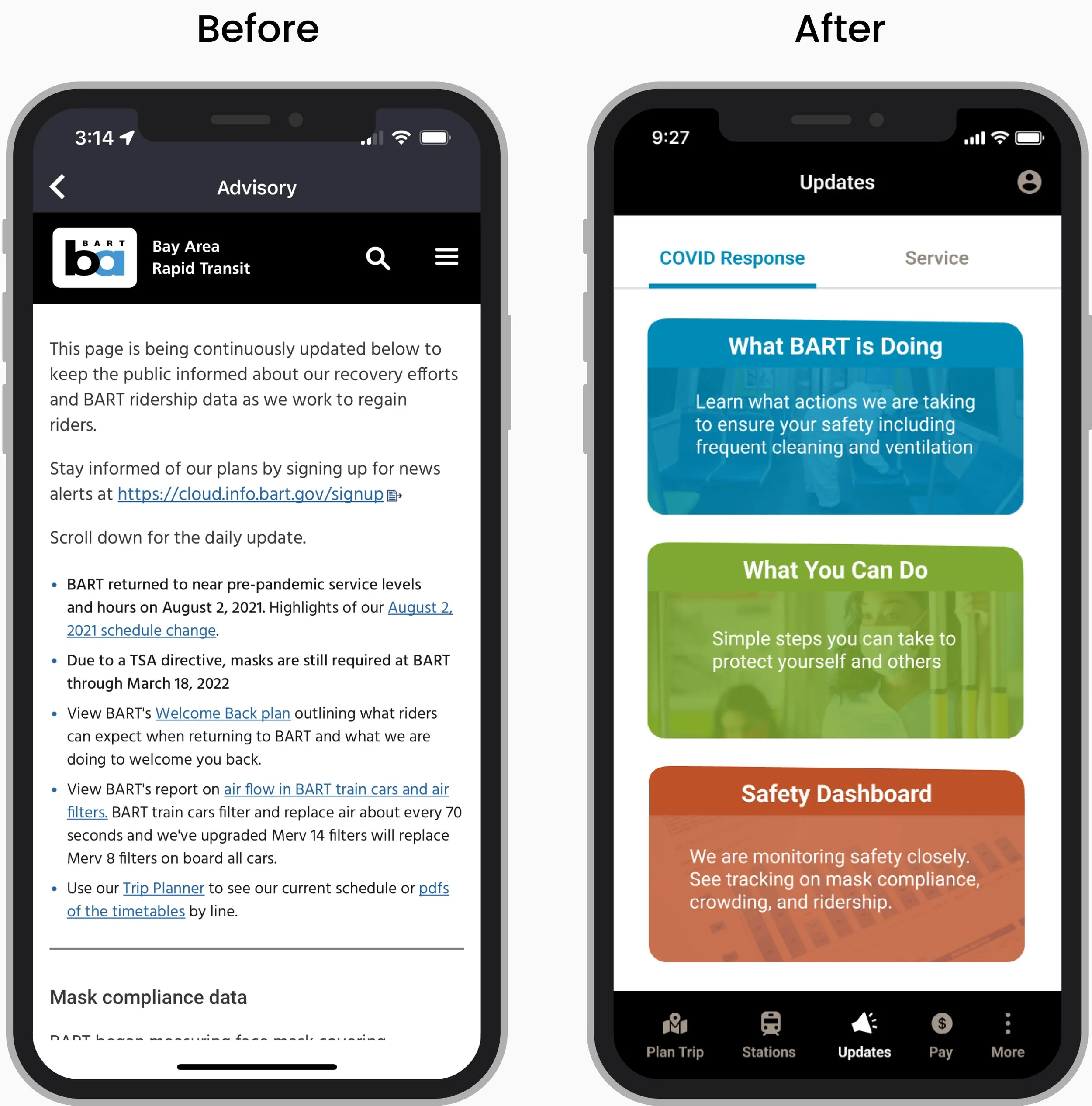
Safety information was hidden in an advisory drop-down, which required users to open and click on an ambiguous CTA. The 15-step plan was buried within a text-heavy page.
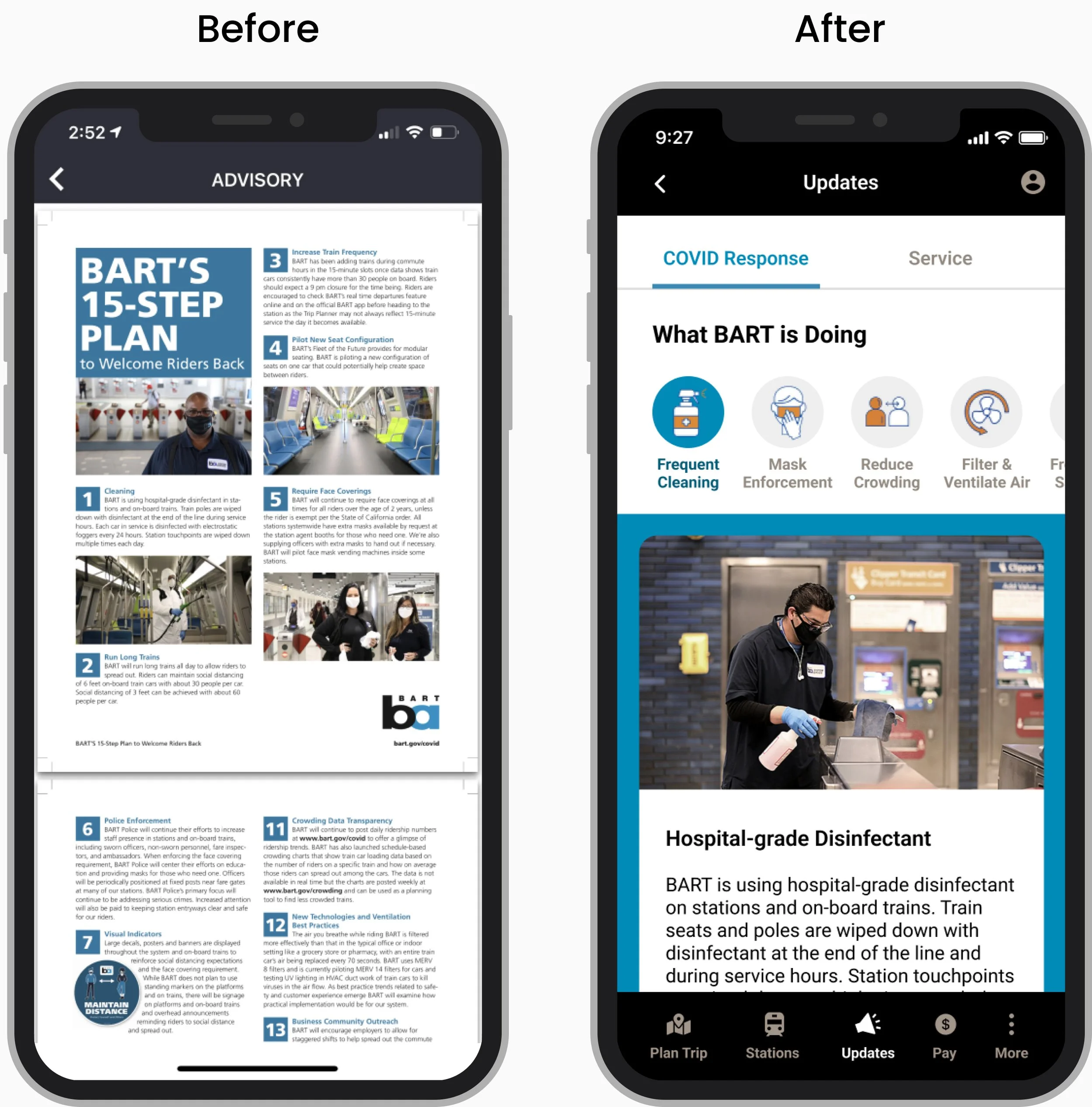
Too Many Steps & Not Mobile-Friendly
While well-intentioned, the 15 steps spanning two pages was overwhelming. The PDF format made it difficult to read as users need to zoom in to see the text.
Surveying riders
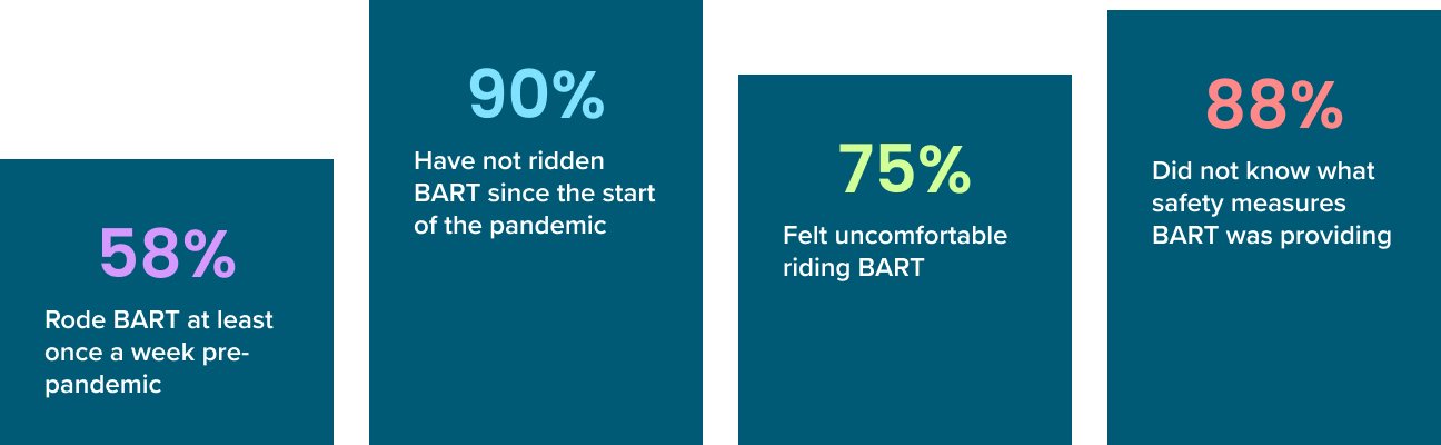
We surveyed 32 BART riders to get a better picture of riding patterns pre and post pandemic and why people were not using BART.
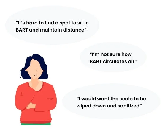
Our findings validated BART’s concern that riders were not aware of the safety measures they were providing. Many of the concerns riders expressed were already being addressed in BART’s 15-step plan.
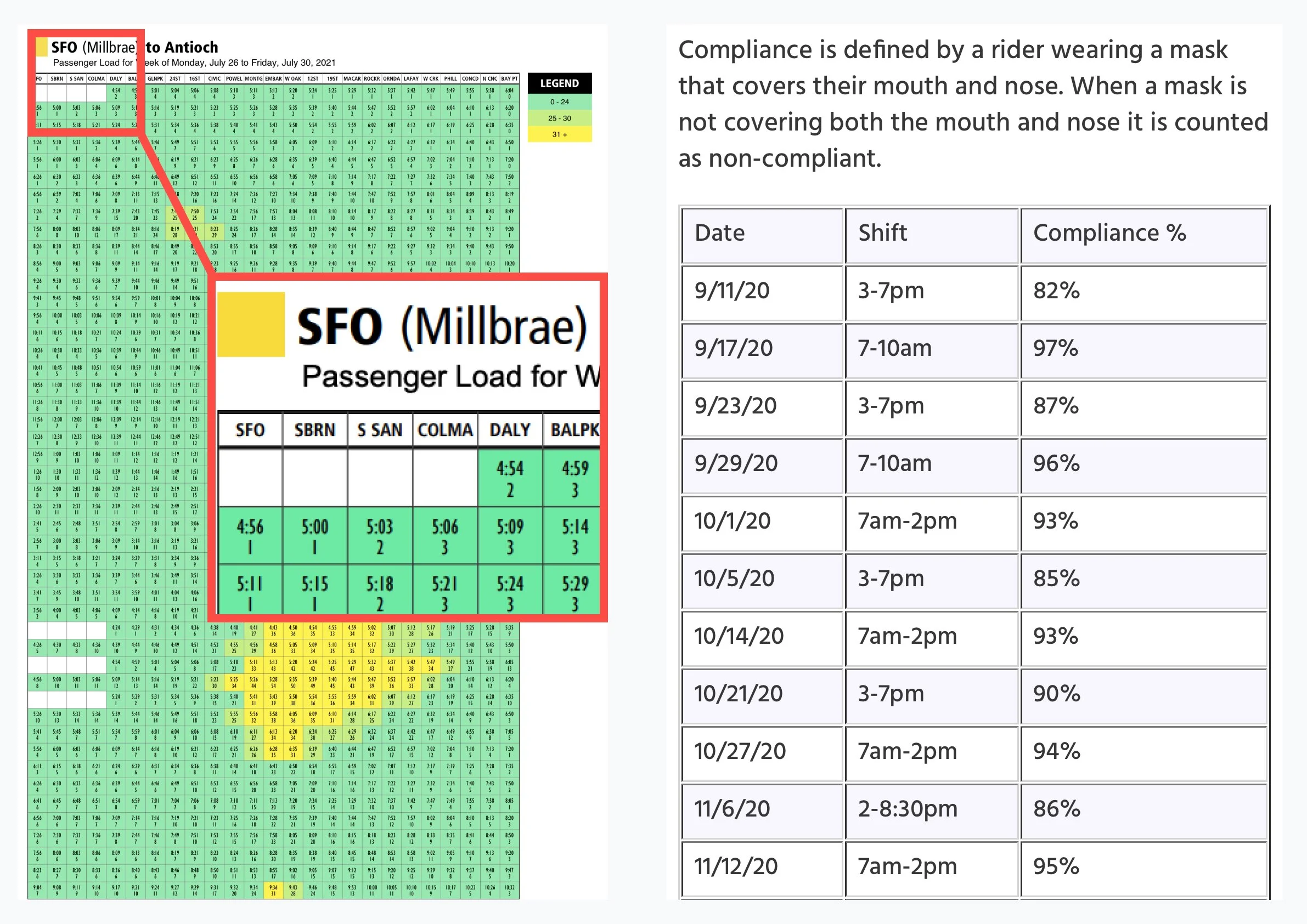
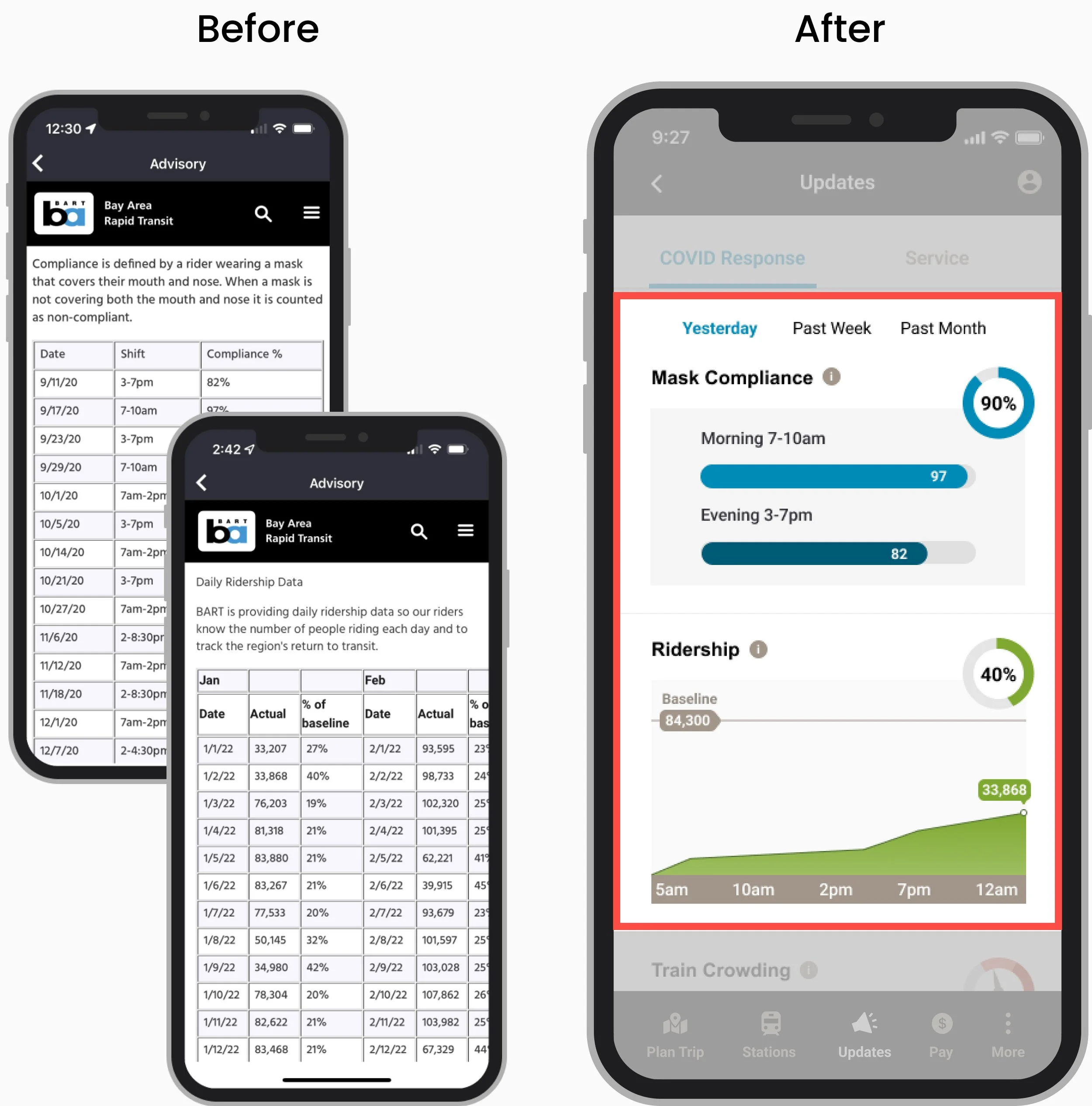
No Data Summarization
Important safety metrics like mask compliance and passenger load on trains were being shared but too dense to consume as they were listed by day and time in long tables and PDF charts and not summarized.
The recreational rider
I created a persona from the user survey and interview insights to help me empathize with BART riders.

Design process
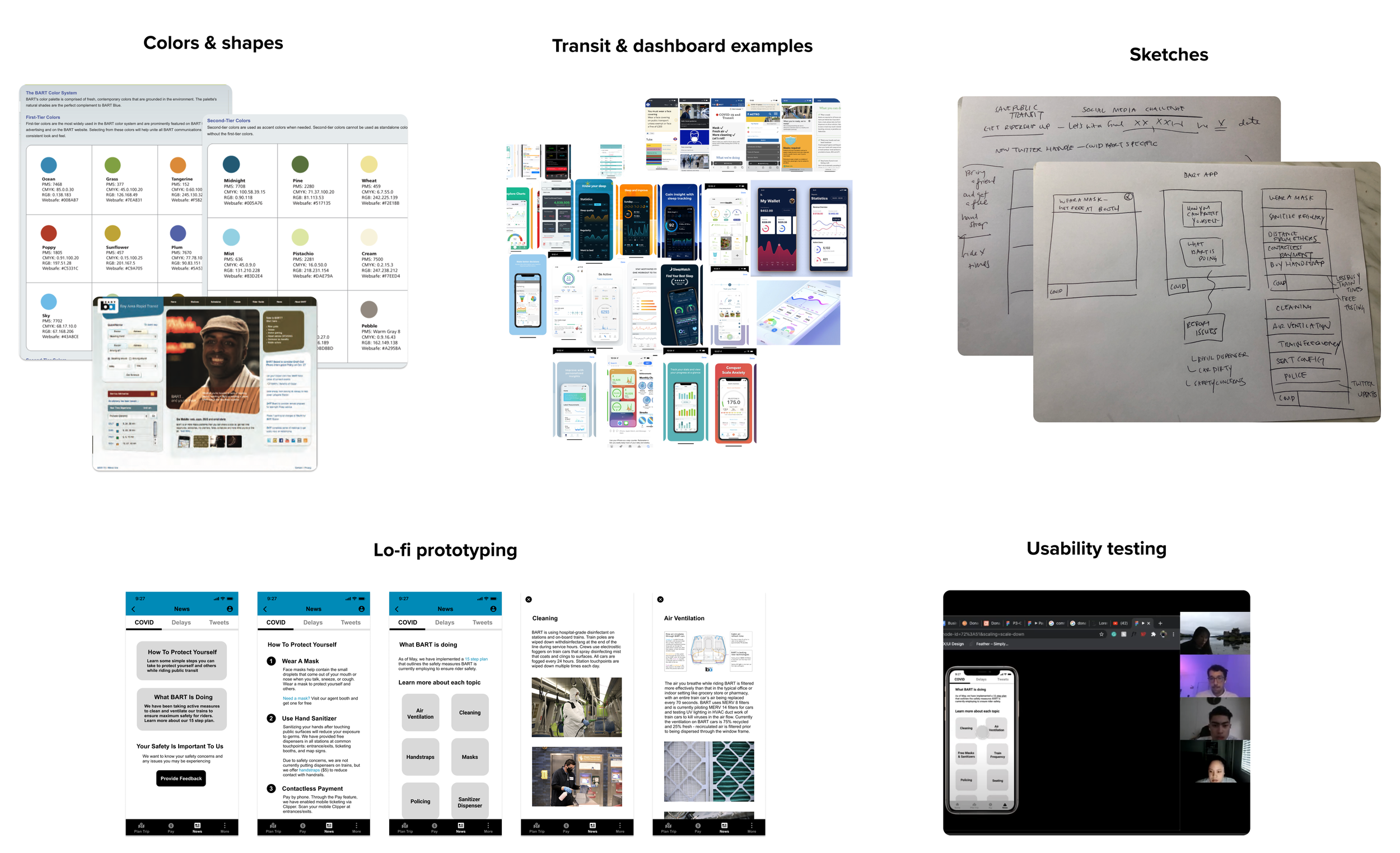
For inspiration, I looked at popular transit and health tracking apps to see how safety information and data trends were communicated. Ideas were then sketched, converted to lo-fidelity prototypes, tested on users, and iterated. When converting to high-fidelity, I followed the official BART brand book closely utilizing their color, font, and shape guidelines.
Solutions
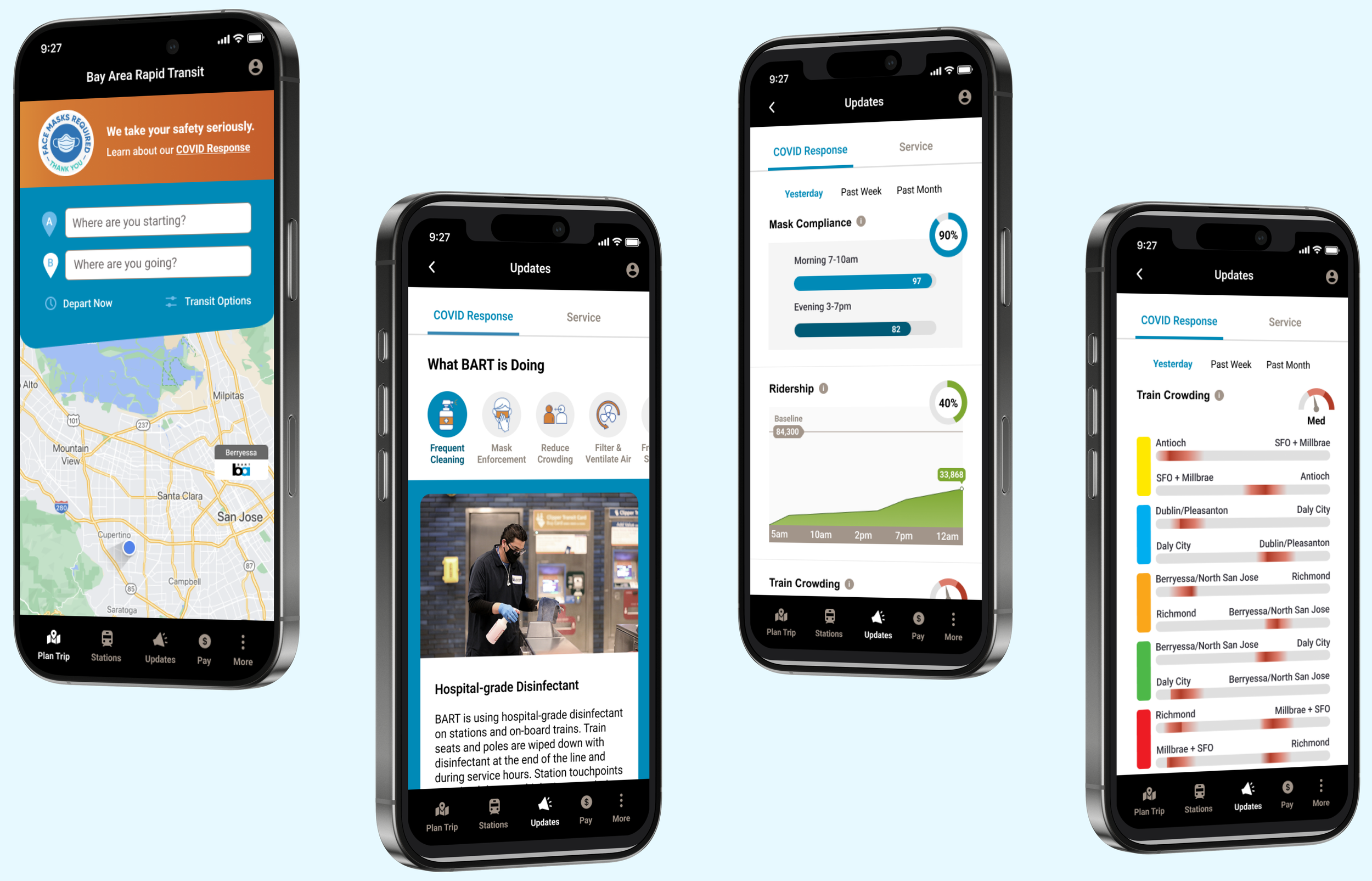
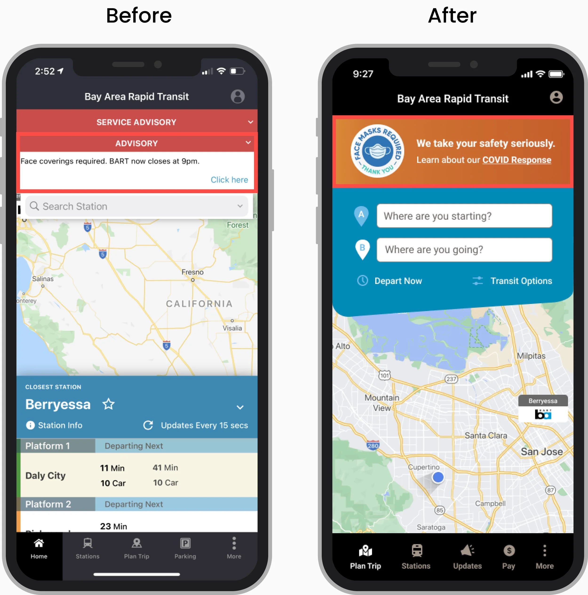
Large and clear banner
I replaced the ambiguous advisory drop-down with a large, colorful banner with a clear CTA that directs users to safety information in a single click.
Accessible from navigation bar
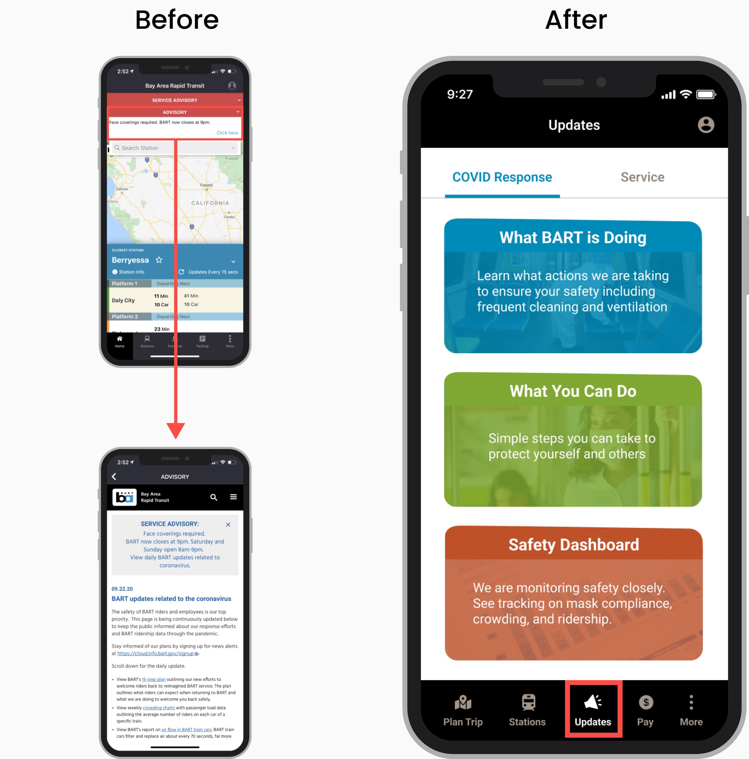
I added a new navigation item “Updates” so users can access safety information from any screen. This increases visibility if users miss the banner or navigate away from the homepage.
Mobile-friendly view for safety topics
I consolidated the 15-step PDF into a mobile-friendly format and prioritized safety topics based on our surveyed riders top concerns: cleaning, masks, crowding, and air filtering.
Organized sections for easy browsing
I organized the text-heavy advisory page by separating safety and service information into tabs and grouping safety topics into 3 sections to make it easier for users to navigate to areas of interest.
Easy chart visualization
I replaced the long mask compliance and ridership tables with visual charts so users can quickly grasp safety insights to guide their riding decisions. Ex: mask compliance was 90% yesterday but more people wore masks in the morning (97%) vs. evening (82%) so it is safer to ride in the mornings.
Train crowding at a glance
Train occupancy was especially difficult to consume as users needed to access by line and time period and then interpret a dense, data-heavy chart. I created a heatmap that enables users to identify crowding hotspots quickly across all lines, which they can tap into to find line-specific information like what times are more crowded / less safe to ride.

Next steps and final thoughts
Even though this was a short project, we made good progress towards understanding BART’s ridership challenges and proposing viable solutions. If given more time, I would love to continue to test and iterate my hi-fidelity designs and encourage BART to adopt some of our easier to implement ideas. Simple changes like improving banner visibility and language could go a long way in ensuring people are aware of all of the measures BART is taking to keep riders safe and in turn, improve their ridership numbers. I’m grateful to Alicia Trost, BART’s chief communications officer, for spending the time to give us the insider perspective. Her insights heavily influenced our project scope and direction.